CONTENTS
- Full Cast Feature Poster
- Making of the Poster
- The Cast
- Relationships
- Design
- Downloads
- Extras
- Making of the Poster
The Poster Gallery
PAGE TWO
3. Full Cast Feature Poster (Released 02/05/14)

Making of the Poster
This poster coincided with the release of the feature trailer on February 5th, two days after the teaser posters made the scene. On this one, I think you can tell by its bang, I really went all-out.
Five days after this one’s release, the main feature poster and its proud display of “TID’s Trekkie foursome” was released. But beforehand, I wanted a gala poster that colorfully featured the whole ensemble.
By far, this poster was the most involved. I’ll give commentary on the gem through each member of the cast that I had the joy of arranging together.
The Cast
James
On the main, definitive-poster-to-be, James was adorned in his blue Star Trek uniform with “Enterprise in hand”. How could I not use that frame of his Trekkie explosiveness for the poster? But I also wanted to showcase the charming fedora-clad wardrobe of his from the film’s first act. This poster gave me the fun chance to do so.

First cutout of James for Full Cast Poster
The picture above was the original cutout I used. I made the cutout from the frame below.

Frame of first cutout of James for Full Cast Poster
I selected this frame because of its wide encompassage. But ironically, I felt it was too distant. I wanted a more intimate facial expression. I wanted to capture a moment of joy, style, and personality.
James had no problem smiling and having a good time throughout the thousands of frames that made up Trekkies Into Darkness, but I sure had a hard time finding him doing so, without his hat, atop, out of frame.
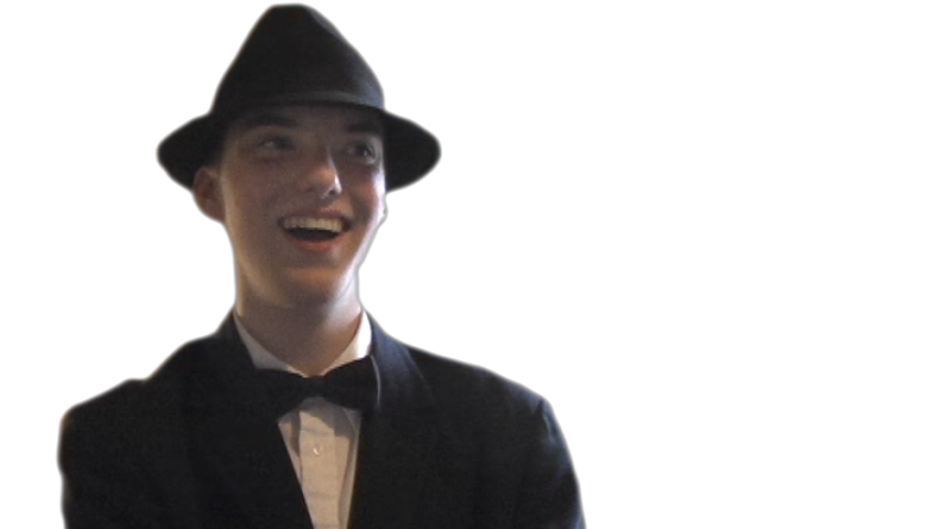
Used cutout of James in Full Cast Poster
I did an excessive amount of brightening and contrast boosts on the final cutout, and I even placed a brighter spotlight around his face, to further bring it out. (This addition was not made with the cutout.)
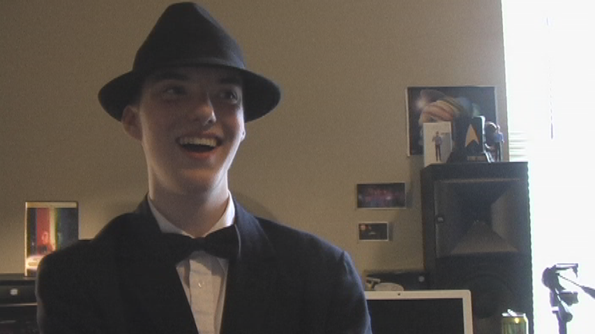
Frame of used cutout of James for Full Cast Poster
John
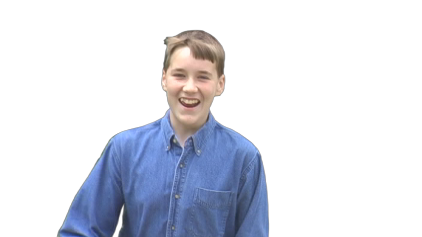
I adore John’s cutout. He looks like he’s about to leap out of the poster with all that exuberance.
Cutout of John in Full Cast Poster
John looks as best as I’ve ever seen him in Trekkies Into Darkness. In this frame, his youth and energy joins with that summer time feel of green grasses, playing outside, and wind through your hair. Poetic, I know. I draw nostalgia from the image, taking me back to childhood memories growing up with James and John.
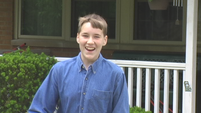
Frame of cutout of John in Full Cast Poster
EJ
EJ was a wonderful personality in Trekkies Into Darkness. Sophie was the villainous mascot of Trek hate, and EJ was the backbone of it. Once Sophie was catapulted off the ranks of such, EJ rose to the top. I wanted EJ in this poster to have a self-awareness above the rest of the cast, that showed she was in the know.
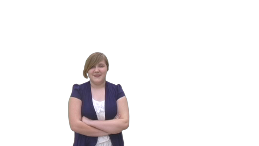
Cutout of EJ in Full Cast Poster
If there was a dialog balloon above EJ, it would say: “Yep. Here I am. I’m on the poster. I hate Trek. You’re never gonna believe what happens to my sister.” I gave her an omnipotence that resounded with a sly smile, her crossed arms, and a mocking gaze toward the viewer.
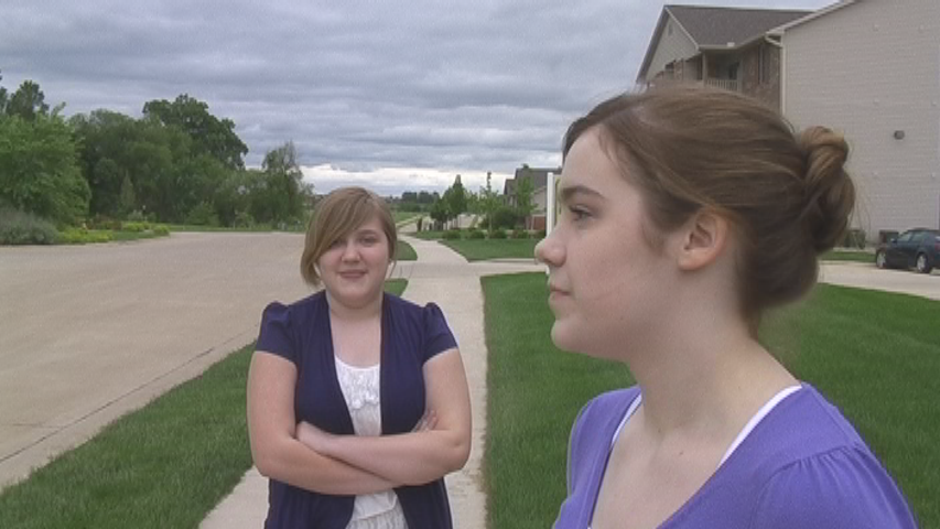
Frame of cutout of EJ in Full Cast Poster
The moment I made the cutout from was no less a sharp embodiment of this.
Sophie
And now for the mantelpiece of Trekkies Into Darkness, herself. As loathing queen of Trek disparagement, I wanted a still of her that met that. But I settled for something more.

Cutout of Sophie in Full Cast Poster
This image is timeless. It’s her in a quiet reflection of the past, and a ponderous look off into the future. Although it is her, post-convertion, it doesn’t limit our interpretation of it to that time of the film synonymous with her conversion.
I find that with isolating the moment, a deeper portrait emerges.
Frame of cutout of Sophie in Full Cast Poster
I know it’s come as quite a shocker, but this is the same frame that EJ’s cutout was taken from. The moment was visually perfect for the both of them, in light of what was behind it.
It’s almost as if the converted Sophie is waiting with reference, for herself to become what she is destined to be, and then can erupt with joy after a revelation. Confusing? Well, it became a unique perspective of characterization that doesn’t exist in the film in the manner as it does, here. Why? It’s because this was buildup to the film, before the linear timeline of Sophie was revealed. It’s just a little poetry.
How I positioned Sophie on the poster emphasizes all that. I wanted her cutout to be the largest, so that all these poetics had a dominating presence over the rest of the cast. The rest of the cast have varying smiles that reflect their personalities, but Sophie’s is without a smile, while still having a lightness that is appropriately Trekkies Into Darkness.
Wes
As with Sophie, there was never any use of my image in a poster from more than one particular act of the film. In my case, the first act of film, when after the movie, the gang had a roundtable discussion. Earlier in the film, James complimented how I looked in my suit and tie. I guess that’s among the many opinions we share.

Cutout of Wes in Full Cast Poster
The suit and tie lends a stylish visual, accompanying who I am. It was the best way to visually “trademark” my character. I’m a sucker for style and suits.

Frame of cutout of Wes in Full Cast Poster
I must admit, my cutout job wasn’t as clean as some of the others, but it didn’t bother me enough to painstakingly redo it. I feel a slight bit of nakedness in saying that, but it’s not a weighty problem—more an imperfection.
Grace
While Grace didn’t achieve nearly a fraction of Trek hate the brutish Sophie and the lampooning EJ exemplified, Grace was among the anti-Trek. Not an icy hater, but far from a galaxy-hopping, uniform-wearing, Tribble-owning, Klingon-speaking Trek lover.
Grace’s Star Wars shirt is a lovely way off subtly hinting this. It’s a polite pollutant towards Star Trek.
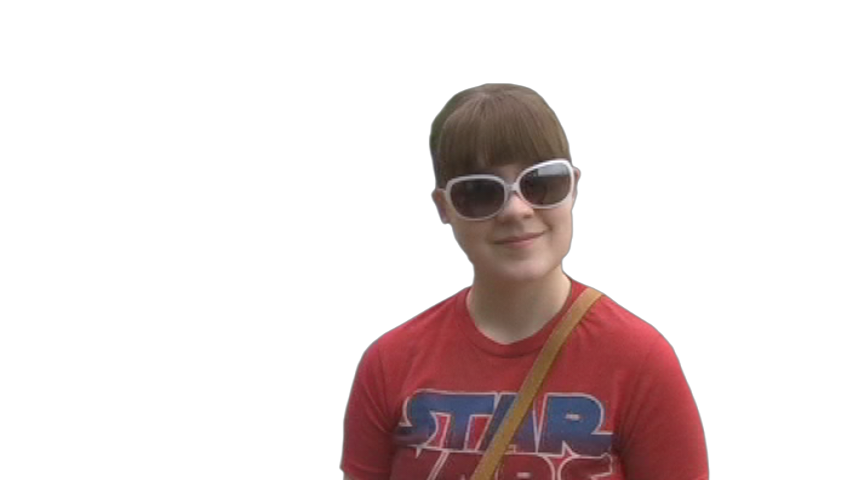
Cutout of Grace in Full Cast Poster
I also like the shades. They’re fashionable, and serve Grace’s private personality. A gracious smile, a Star Wars shirt, and sunglasses—perfect.
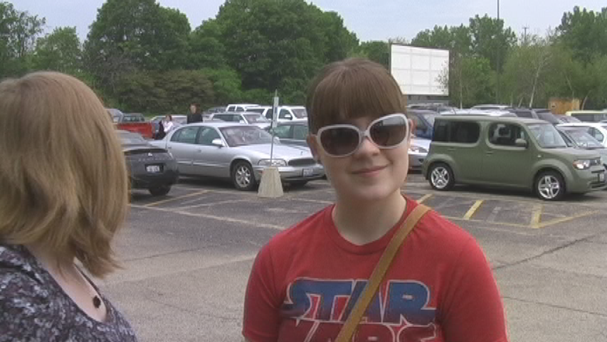
Frame of cutout of Grace in Full Cast Poster
Anna
Anna has about as much screen time as the frog, but her wholesome personality and simple nature made a nice addition to the film. Certainly to the poster.

Cutout of Anna in Full Cast Poster
While Anna was not a Trekkie, nor did she refrain from “laughing at your little talk”, her innocence, otherwise, and bright positivity, kept me from villainizing her.
I started off the poster with a Trek, anti-Trek, side-by-side theme, in mind. That focus entirely diminished by the time I’d finished. Probably because Anna fell on the side of what would’ve been the complete Rouge’s Gallery of Villains.
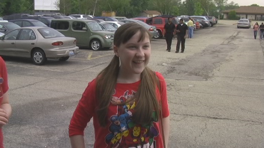
Frame of cutout of Anna in Full Cast Poster
In the end, she’s one more among the nerdy cast. The more, the merrier.
Relationships
Now that we’ve got the cast “in the can”, let’s analyze how key relationships of the characters speak through how they’re laid out.
Wes to James/James to Wes: These two are best of friends—iron sharpening iron since 1996. They’re placed alongside each other, and are the second largest cutouts under “Queen Sophie”. But there’s one subtle thing that divides them. It’ll become clear to you with Wes to Sophie/Sophie to Wes. See if you can guess it, and I’ll mail you a lollipop.
James to Sophie: These two, I consider apart of a trio I’m middle man of. I’m what brings them together. James emotes a grand joviality. Perhaps, as he’s sort of facing Sophie’s direction, he’s overjoyed with the prospect of her “salvation”, amidst the overall brightness of the film.
Sophie to James: Taking the poetics I discussed of her cutout into account, James symbolizes Star Trek and Star Trek fandom. Sophie is in quandary as she peers off into her future, and sees the welcoming Trekkies in it.
James to Anna/Grace/EJ: Let us draw back to that joviality James expresses. It is his fondness for the whole assemblage, and once again, an overall brightness of the film.
EJ to Sophie/Sophie to EJ: There they are—the two anti-Trek mascots. EJ stands right below Sophie as first anti-Trekkie in command. But once you’re “in the know”, EJ’s look, here, carries more meaning. Her arms are folded with a sly smile extended directly at the poster’s beholder—a complete opposite of how the view of Sophie in her cutout is composed. This acknowledges the post-convertion separation between the two. You’ve probably picked up on how a cutout’s relationship with another cutout can hold multiple themes. Sometimes they’re linear in the film, but mostly are not. Especially in Sophie’s case, as I elaborated, above.
EJ to James/John: What can I say of EJ’s relationship to James and John that is better suited than a phrase of common parlance in the heyday of a Trek-hating Sophie, “He’s a dirty Trekkie!” EJ turns her back to the Trekkies, on her side of the poster.
John to James/James to John: John is the backbone of Trekdom to James, as EJ is the backbone of anti-Trek to Sophie. Like EJ and Sophie, James and John are firstborn and second born siblings. Unlike EJ and Sophie, their relationship is simply the same from beginning to end. John, naturally, rests below James, similarly exuding the fun spirit of Trekkies Into Darkness. James and John also mirror similar positioning of Sophie and EJ, on their Trekkian side of the turf.
Wes to John/John to Wes: When having a best friend with his brother around, you can bet he’ll be friends with his brother, too. James stands between Wes and John, signifying that he is how Wes and John became friends over the years. John and Wes are also the “clean-cut” Trekkies along with James in the enthusiastic “Trekkie row”.
Wes to Sophie/Sophie to Wes: This is the big one. Trekkies Into Darkness, when you boil it down, is about the relationship of these two—how they bond. You may ask, how can that be here if Wes is a kingpin of “Trekkie row” and Sophie is the linchpin of the anti-Trek side of the fence? Ready for the secret? Wes and Sophie are the only ones facing their direction. Wes has a flicker of the eye, gazing off into destiny, “in the know”, with joy. Sophie directly faces Wes, a best friend, and bastion of the universe she ponders her place in, as she too peers off into destiny. Ready for another secret? Wes and Sophie, despite their vertical separation, are right across from each other. Once again, multiple themes express themselves—acknowledgment of Wes, the Trekker, and “Queen Sophie” of Trek hatred. And the greater association of the two: the strong connection between them that is supported visually, with sensational subtlety.
While it’d be fun to write, not every relationship between every character is a key ingredient of the film and the poster. If I were to write how every character relates to another, we’d have forty-nine columns above us instead of nine. I think forty-nine is a little unnecessary, don’t you?
Design
Having tackled the choices made and artistic takes on how the cast was put together, I’ll shed light on the other elements.
Title: I imagined a flavorful variation of the Trekkies Into Darkness title would be alluring, so I italicized the title as I’d done on the Wide Supplemental, giving it momentum. I lessened the gap between “Trekkies” and “Into Darkness”, giving it tightness. I stacked many layers of new texture, gradient, shadowing, masking, on top of each other. The end product was a flashy and vibrant rejuvenation. I must say, creating varying designs for the title gives me excitement—the mystique of a different title design than what actually is in the film. Though, this is the closest title design to the one in the film. I went on to use this one on the trailer thumbnails, and as a general logo for the film.
![]()
The Trekkies Into Darkness logo
Footer: I also incorporated the arc, or, the planetary ellipse from the teaser poster, at the foot of the title. “TID’s Trekkie foursome” are in there, too, but I gave them an appropriate amount of transparency.
Glow: I duplicated each layer of cast cutouts. I took the duplications and set them below all else. I blurred, applied a unique color, and applied varying degrees of transparency on each duplication. This is pretty instrumental in the knockout energization the poster has. I also had a blurred duplication of the title under its forefront layers, for all those fans of it that were hoping for an acknowledgment.
Heck, I might’ve added more stars in the background, too…
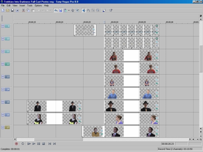
The editor’s view of the Full Cast Poster
Only nine of thirty-three layers can be seen at a time when in the project file. Such is the case, above. Here’s a throwaway fun fact finale: James and I were the only ones sitting down in the frames our cutouts were taken from. Now that we got that most crucial tidbit out of the way…
In conclusion, I’m overjoyed by how this poster turned out. I love its explosive spirit and dazzling display of the ensemble that were the faces of Trekkies Into Darkness.
Downloads
Extras
- First cutout of James for Full Cast Poster
- Frame of first cutout of James for Full Cast Poster
- Final cutout of James used in Full Cast Poster
- Frame of used cutout of James for Full Cast Poster
- Cutout of John in Full Cast Poster
- Frame of cutout of John in Full Cast Poster
- Cutout of EJ in Full Cast Poster
- Frame of cutout of EJ in Full Cast Poster
- Cutout of Sophie in Full Cast Poster
- Frame of cutout of Sophie in Full Cast Poster
- Cutout of Wes in Full Cast Poster
- Frame of cutout of Wes in Full Cast Poster
- Cutout of Grace in Full Cast Poster
- Frame of cutout of Grace in Full Cast Poster
- Cutout of Anna in Full Cast Poster
- Frame of cutout of Anna in Full Cast Poster
- TID logo
- Screenshot of Full Cast Poster project file
Main << Page 1 << Page 2 >> Page 3
{TID Home(Cast, Summary, Full Plot, Links & Downloads) | Poster Gallery | Trailer Gallery | Premiere Event | The Audio Commentary|The Theater| The Making Of }
![]()
